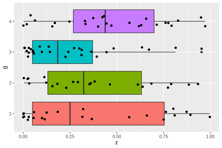
R Graphics
[1]:
library(tidyverse)
Registered S3 methods overwritten by 'ggplot2':
  method         from
  [.quosures     rlang
  c.quosures     rlang
  print.quosures rlang
── Attaching packages ─────────────────────────────────────── tidyverse 1.2.1 ──
✔ ggplot2 3.1.1     ✔ purrr   0.3.2
✔ tibble  2.1.2     ✔ dplyr   0.8.1
✔ tidyr   0.8.3     ✔ stringr 1.4.0
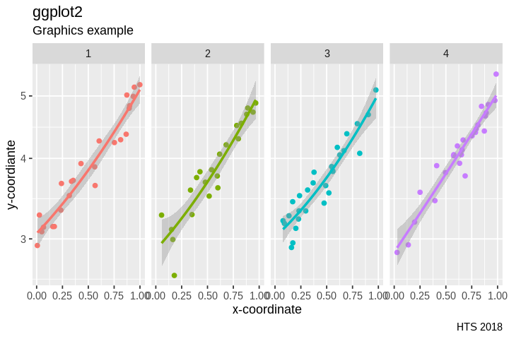
✔ readr   1.3.1     ✔ forcats 0.4.0
── Conflicts ────────────────────────────────────────── tidyverse_conflicts() ──
✖ dplyr::filter() masks stats::filter()
✖ dplyr::lag()    masks stats::lag()
[2]:
options.orig <- options(repr.plot.width=6, repr.plot.height=4)
Simulate some data for plotting
[3]:
n <- 100
x <- sort(runif(n))
y <- x^2 + x + 3 + 0.2*rnorm(n)
z <- x^2
g <- as.factor(sample(1:4, n, replace=T))
df <- tibble(x=x, y=y, z=z, g=g)
Grammar of Graphics
ggplot2 uses a Grammar of Graphics convention to define plots. See The fundamentals of ``gggplot2` explained <https://www.aridhia.com/technical-tutorials/the-fundamentals-of-ggplot-explained/>`__ for a simple epxlanation.
The main concents are
data source
map data elements to visual characteristics (aes)
type of visual elements in plot (geom)
layers (+)
facet to automatically show “group by” plots
scale to controls how the mapping is made
statistics to add summary data to the plot
themes to define the look and feel of the plot
[4]:
g0 <- ggplot(df, aes(x=x, y=y))

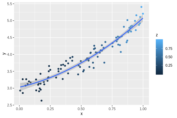
g1 <- g0 +
geom_point(aes(col=z)) +
geom_smooth(method='lm',
            formula=y ~ poly(x, 2, raw=TRUE))

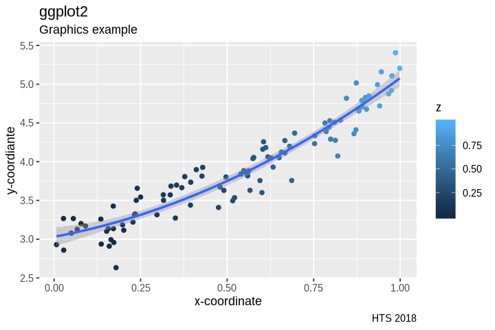
g2 <- g1 +
labs(title="ggplot2",
     subtitle="Graphics example",
     caption="HTS 2018",
     x="x-coordinate",
     y="y-coordiante")

g3 <- g2 +
guides(col=FALSE)
[5]:
g0
[6]:
g1
[7]:
g2
[8]:
g3
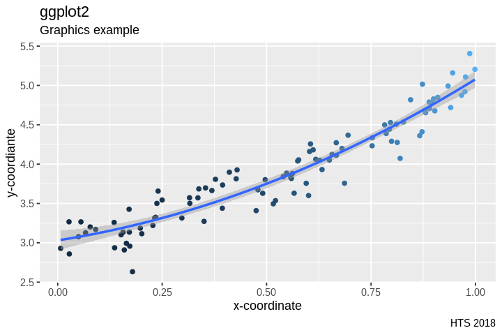
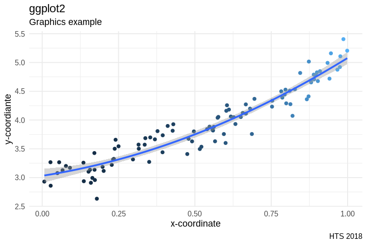
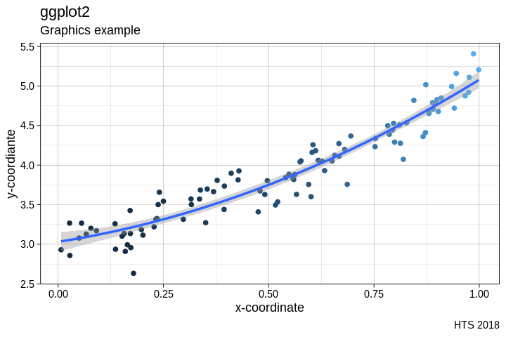
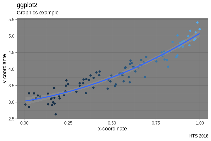
Interpration
What is the data source?
What mappings are applid to the plot as a whole? To the points?
What labels are specified and where do they appear?
Wthat geometric objects are used for plotitng?
What statistics are added to the plot?
How was layering used to build the plot incrementally?
How were partially completed plot stages saved?
Facets
[12]:
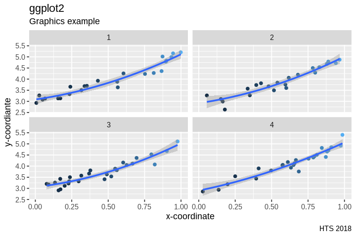
g3 + facet_wrap(facets='g', nrow = 2)
[13]:
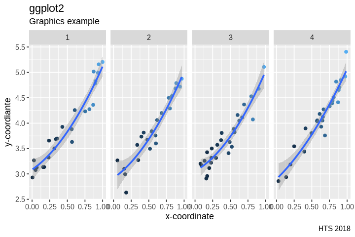
g3 + facet_grid(~ g)
[14]:
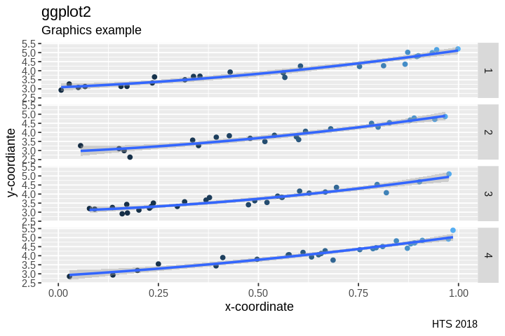
g3 + facet_grid(g ~ .)
Scales
[15]:
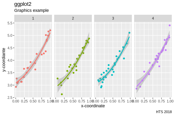
g4 <- ggplot(df, aes(x=x, y=y, col=as.factor(g)) ) +
geom_point() +
geom_smooth(method='lm',
            formula=y ~ poly(x, 2, raw=TRUE)) +
labs(title="ggplot2",
     subtitle="Graphics example",
     caption="HTS 2018",
     x="x-coordinate",
     y="y-coordiante") +
facet_grid(~ g) +
guides(col=FALSE)
Colors
[16]:
g4
[17]:
g4 + scale_color_brewer()
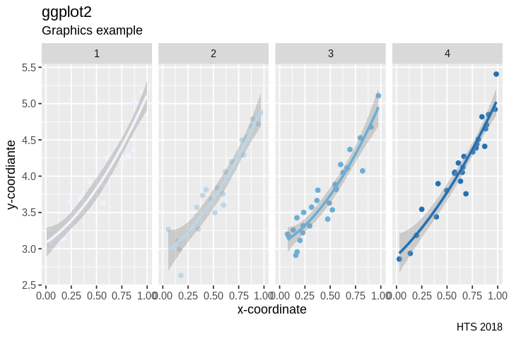
[18]:
g4 + scale_color_brewer(type = 'seq', palette = 'Reds')
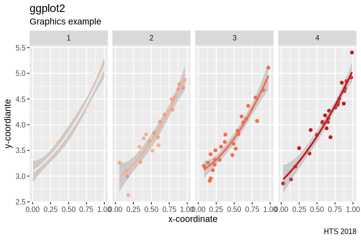
[19]:
g4 + scale_color_brewer(type = 'qual', palette = 2)
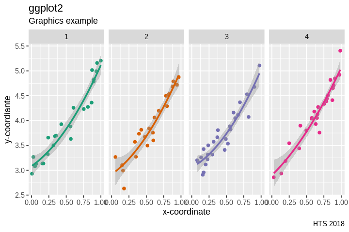
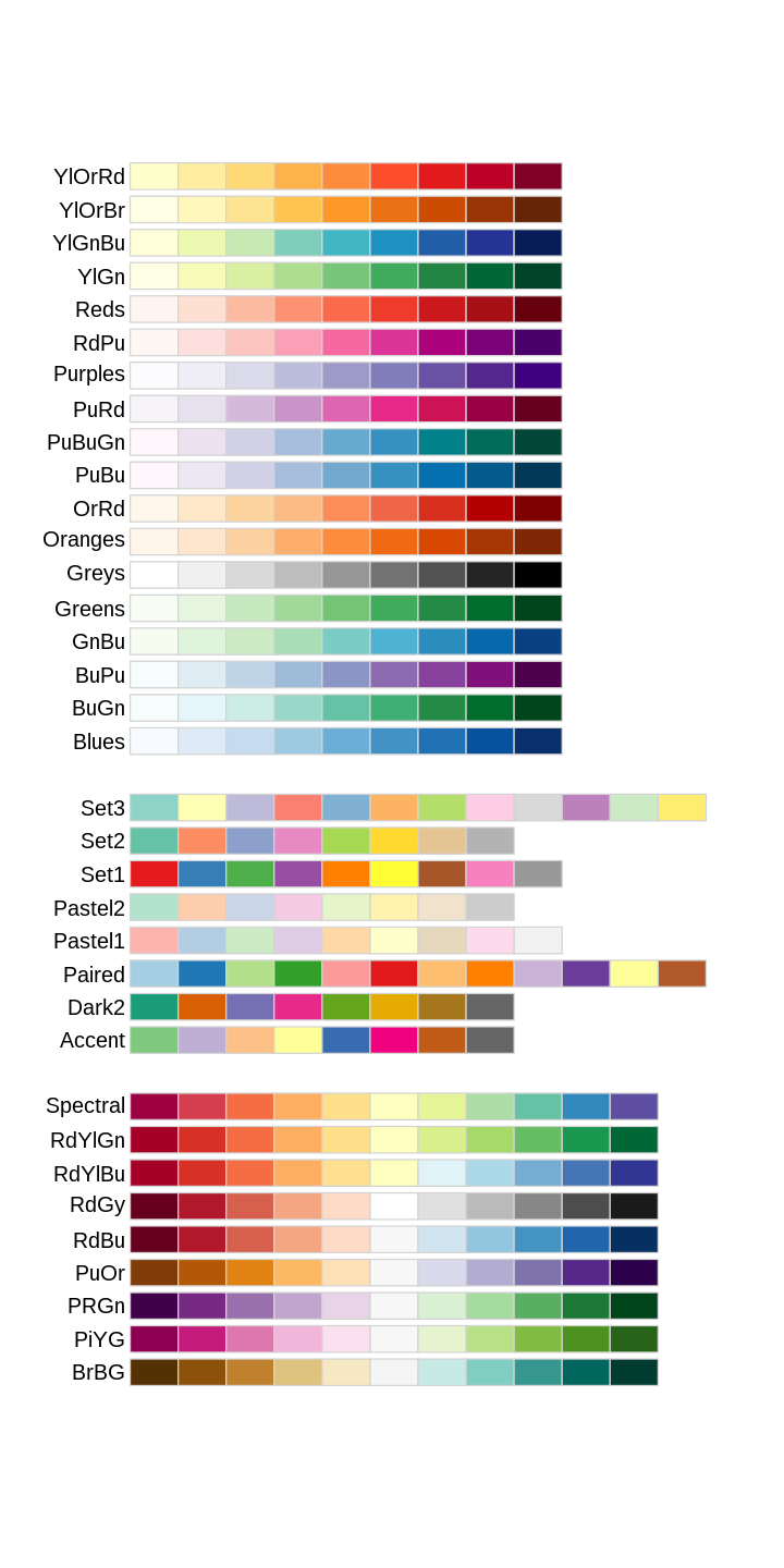
Palettes available from brewer
The 3 plots show color maps that are
Sequential
Qualitiative
Divergent
[20]:
library(RColorBrewer)
[21]:
options.orig <- options(repr.plot.width=6, repr.plot.height=12)
display.brewer.all()
[22]:
options.orig <- options(repr.plot.width=6, repr.plot.height=4)
Scales can be used for changing the mapping of color, fill, hue, size, coordinates …
Here we scale the y-coordinate to show log values.
[23]:
g4 + scale_y_log10()
Geoms
[24]:
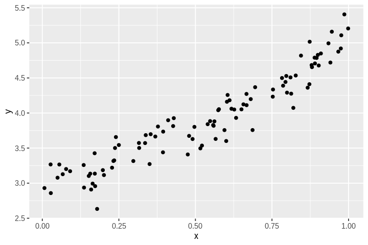
g0 + geom_point()
[25]:
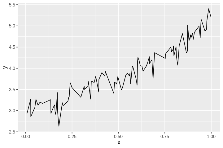
g0 + geom_line()
[26]:
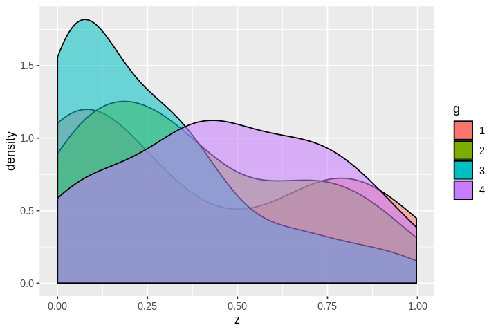
ggplot(df, aes(x=z, fill=g)) +
geom_density(aes(alpha=0.1)) +
guides(alpha=F)
[27]:
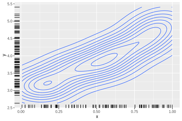
g0 +
geom_density_2d() +
geom_rug()
[28]:
head(df)
| x | y | z | g |
|---|---|---|---|
| <dbl> | <dbl> | <dbl> | <fct> |
| 0.007004594 | 2.930121 | 4.906434e-05 | 1 |
| 0.027106726 | 3.266802 | 7.347746e-04 | 1 |
| 0.027822624 | 2.858423 | 7.740984e-04 | 4 |
| 0.049801753 | 3.077667 | 2.480215e-03 | 1 |
| 0.055586699 | 3.266132 | 3.089881e-03 | 2 |
| 0.066744396 | 3.127579 | 4.454814e-03 | 1 |
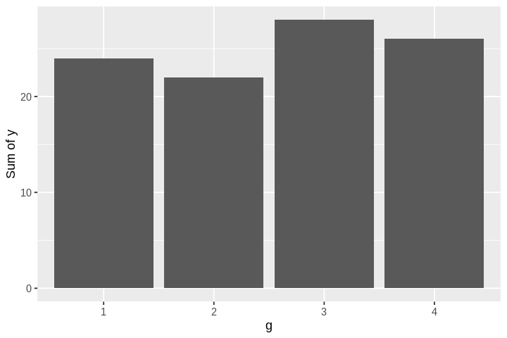
Specify weight parameter to sum over a column by group
[30]:
ggplot(df, aes(x=g, weight=y) )+
geom_bar() +
labs(y="Sum of y")
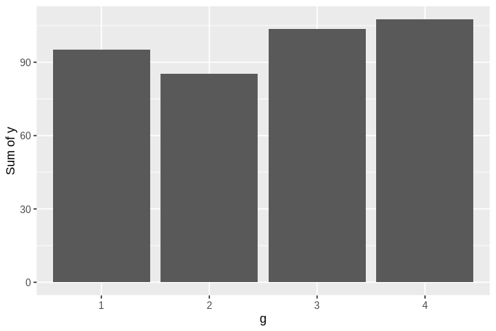
If you already have counts, specify stat=identity
[31]:
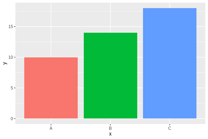
df_ <- tibble(x=c('A', 'B', 'C'), y=c(10, 14, 18))
[32]:
head(df_)
| x | y |
|---|---|
| <chr> | <dbl> |
| A | 10 |
| B | 14 |
| C | 18 |
[33]:
ggplot(df_, aes(x=x, y=y, fill=x)) +
geom_bar(stat='identity') +
guides(fill=F)
[34]:
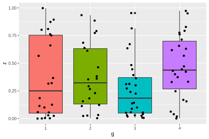
ggplot(df, aes(x=g, y=z, fill=g)) +
geom_boxplot() +
geom_jitter(width=0.2)  +
guides(fill=FALSE)
[35]:
ggplot(df, aes(x=g, y=z, fill=g)) +
geom_boxplot() +
geom_jitter(width=0.2) +
coord_flip() +
guides(fill=FALSE)